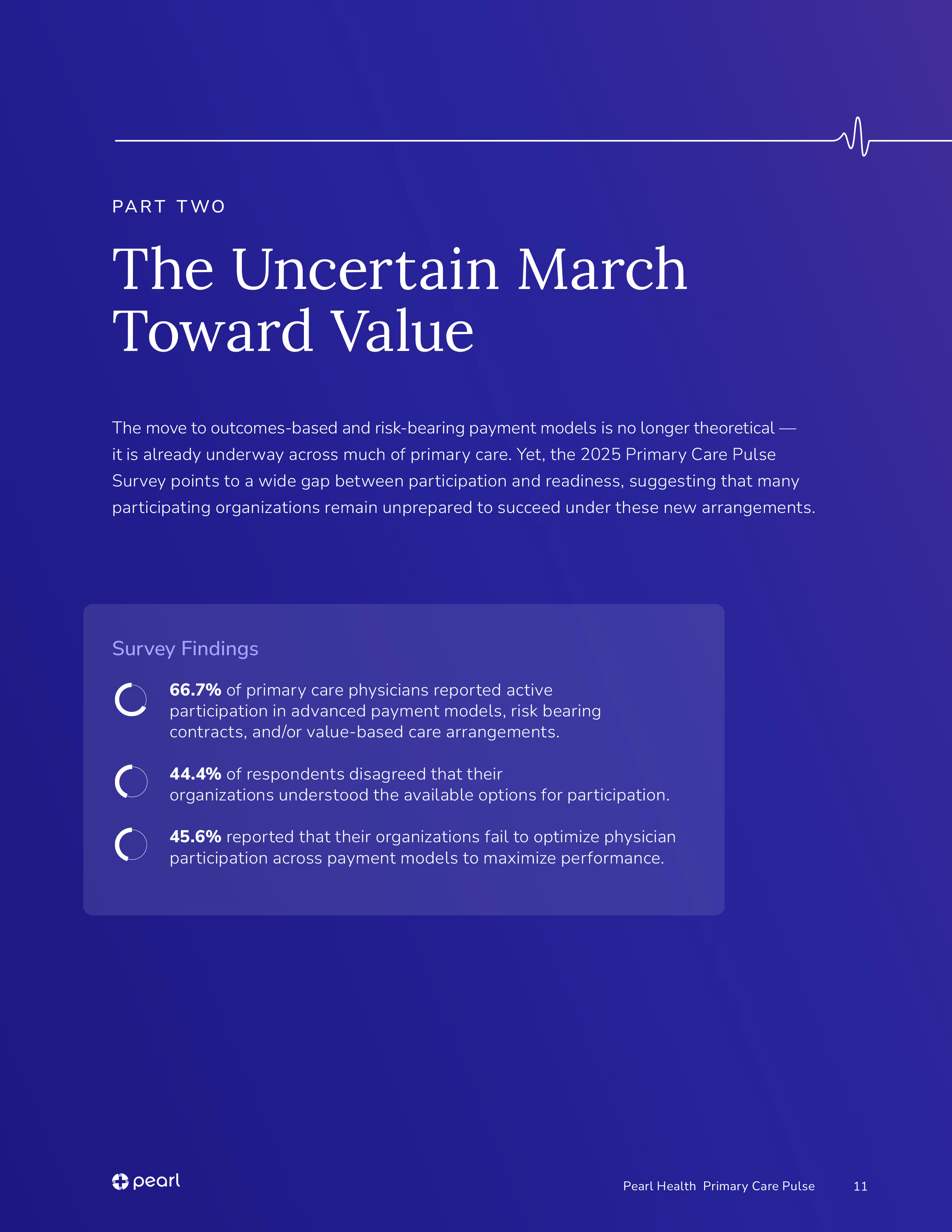
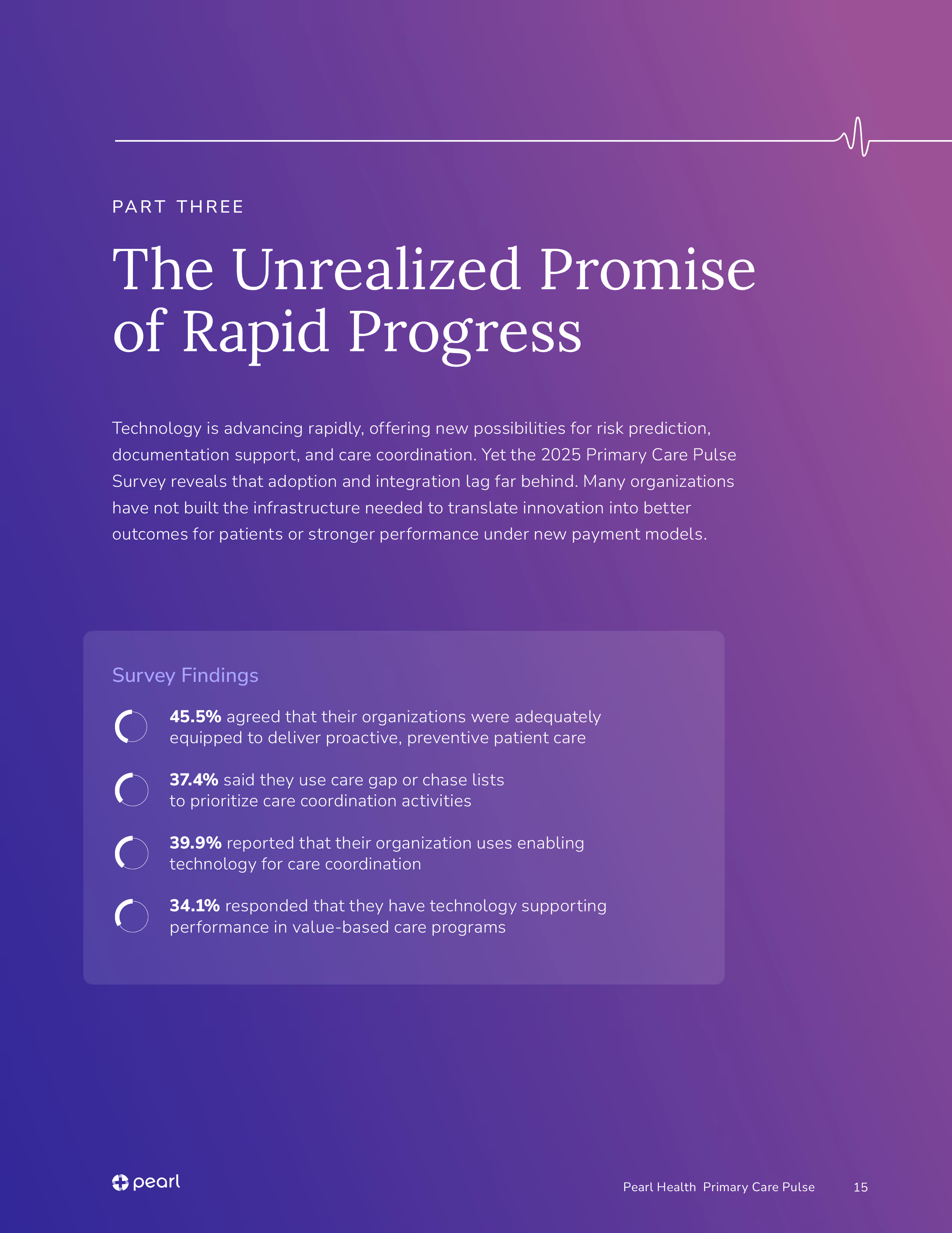
This report was in need of a design overhaul as the previous edition skewed too warm and optimistic for content covering a system under serious strain. With Pearl simultaneously shifting its focus toward enterprise health systems and physician networks, the report needed to grow up visually and tonally, signaling credibility to a more sophisticated audience.
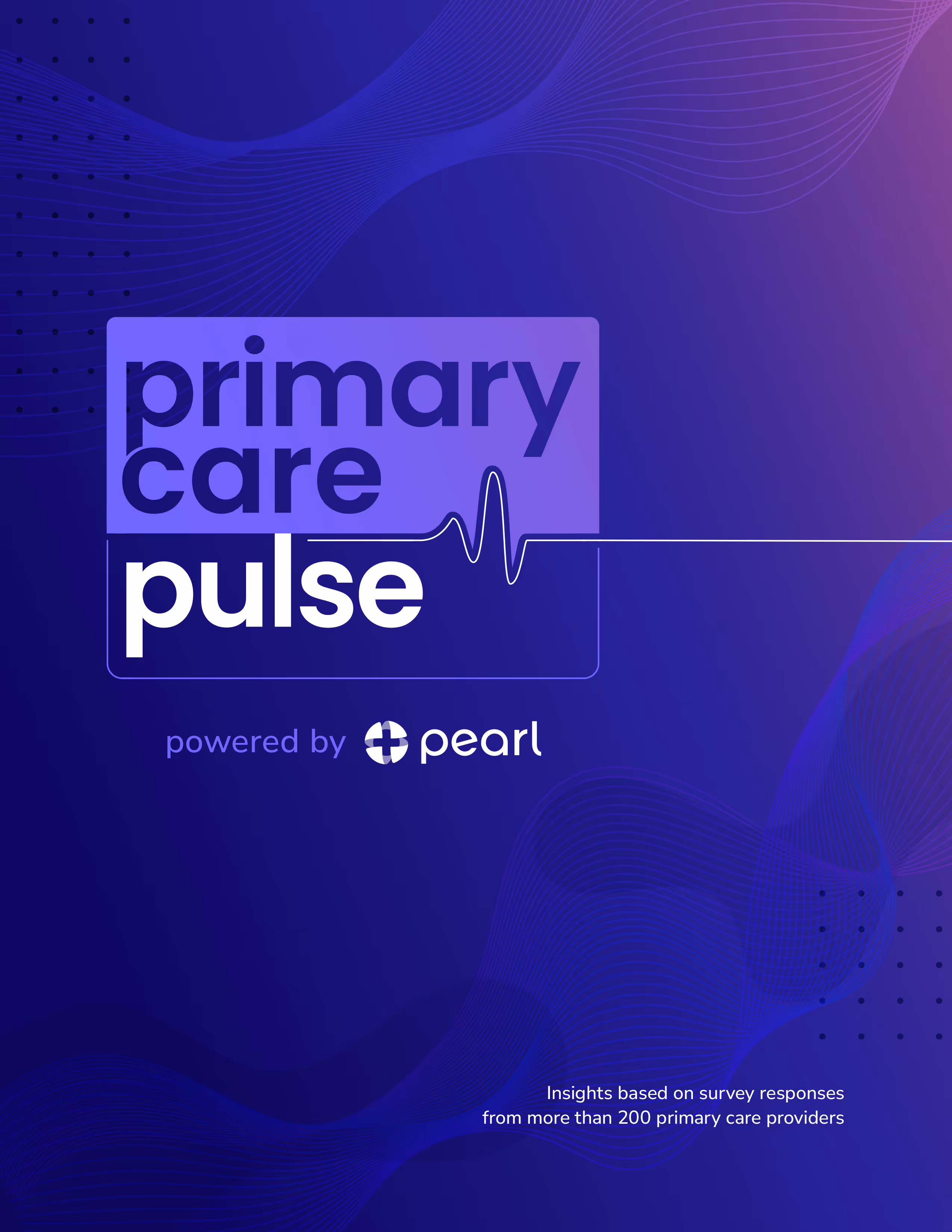
Designing a report credible to enterprise health systems and physician networks required a more considered visual language. Out went the illustrations and bright palette of previous editions, replaced with a darker, more restrained color system and fluid spline wave, evoking both the rhythm of a vital sign and the sophistication of modern health tech.
The result is a comprehensive report identity rooted in a sophisticated, data-forward aesthetic that treats the content with the weight it deserves, positioning Pearl as a mature, authoritative voice in the value-based care space. The system was applied across the full report layout and social assets, creating a polished presence across every touchpoint.
Moodboarding gravitated toward fine linework with a technical feel and a palette that balanced bold accent colors and dark backgrounds.
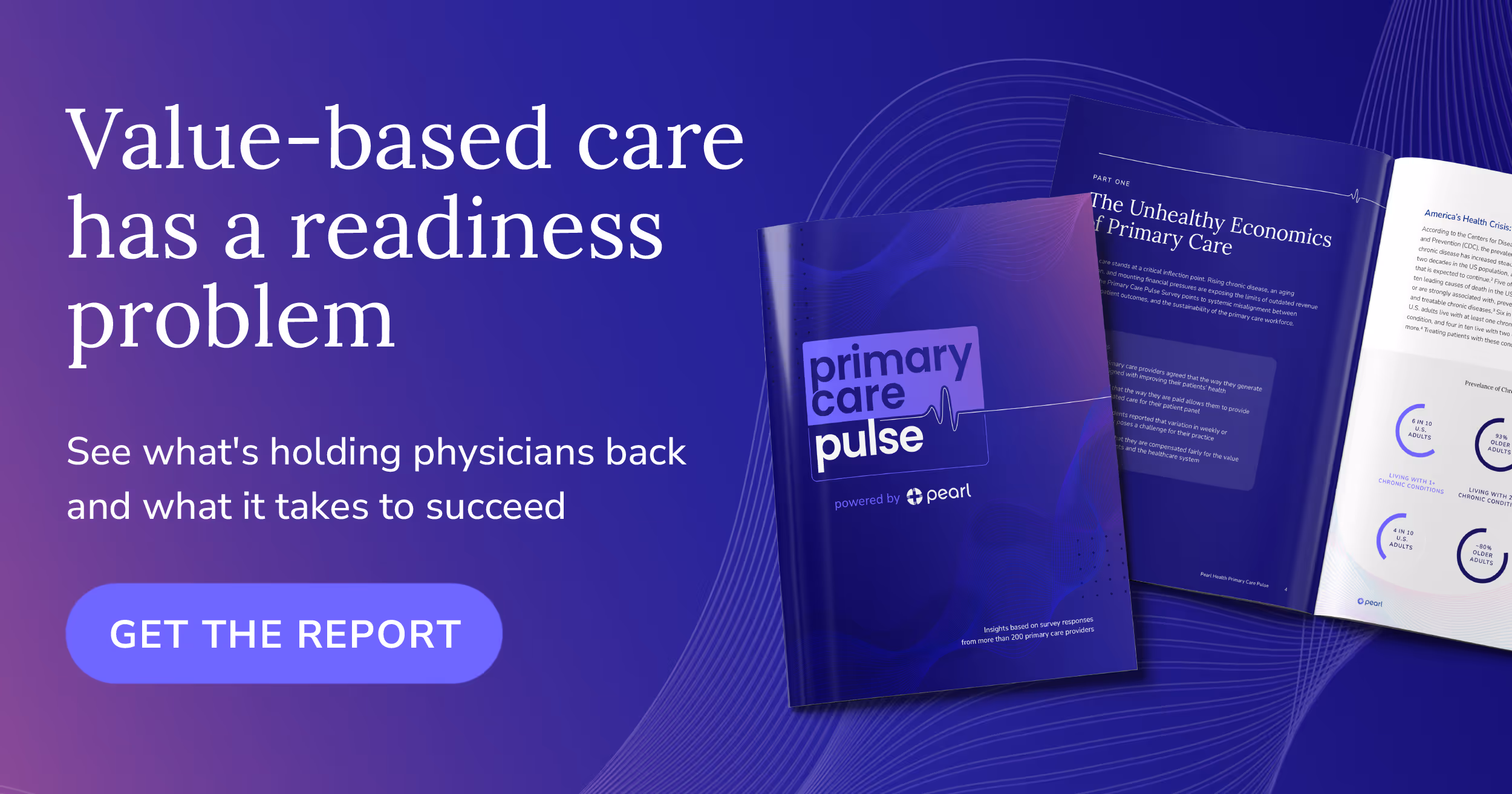
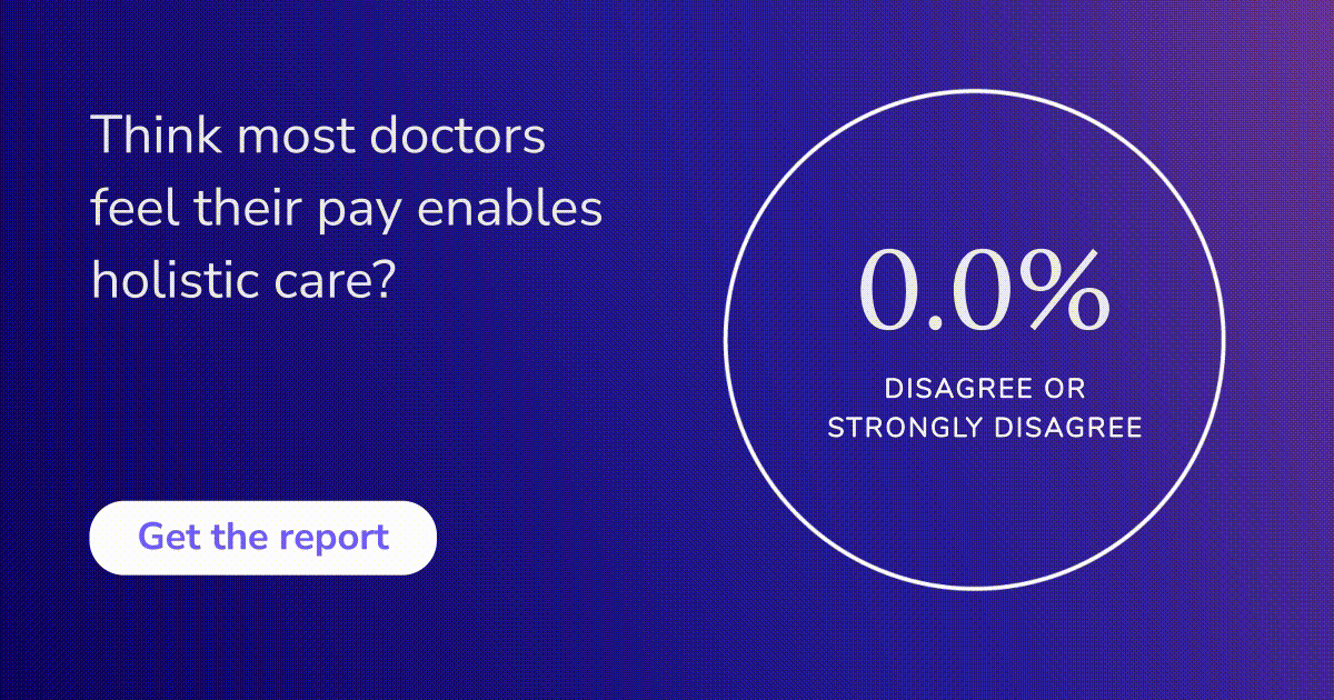
Social assets rounded out the deliverables: a headline-driven download driver and a bold, data-forward statistic card.