Growing quickly from a bootstrapped startup to a leader in the industry, Recharge needed an employer brand to reflect its culture, build trust, and attract top talent, as existing materials didn’t fully convey the company’s values, vibe, or employee experience.
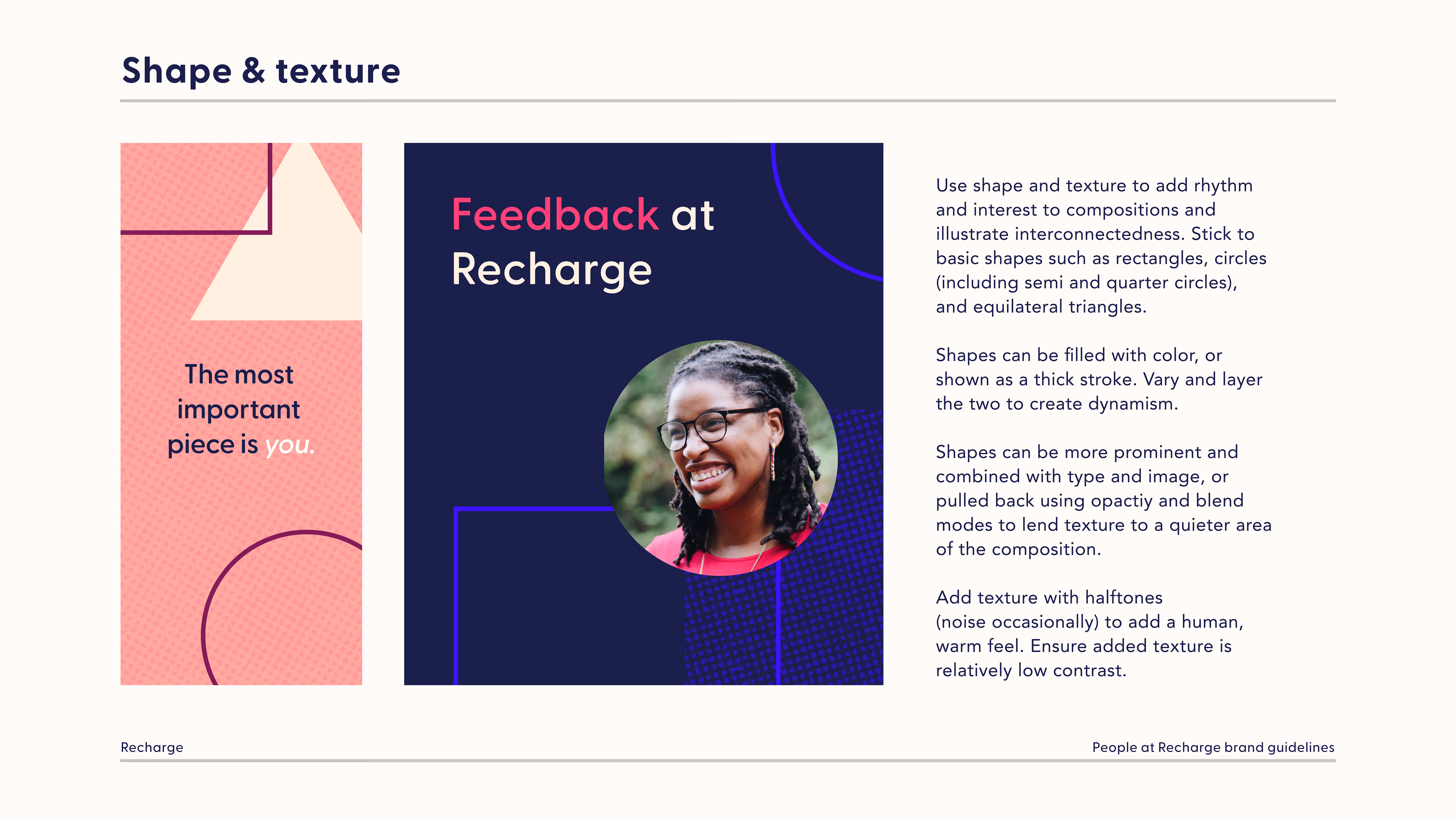
The process started by defining the tone of the employer brand: what does it feel like to work at Recharge? An employee survey and brainstorming sessions highlighted themes of connection, trust, empathy, and individual pieces working together as a whole. Visually, it needed to feel like a natural, familiar extension of Recharge's core brand.
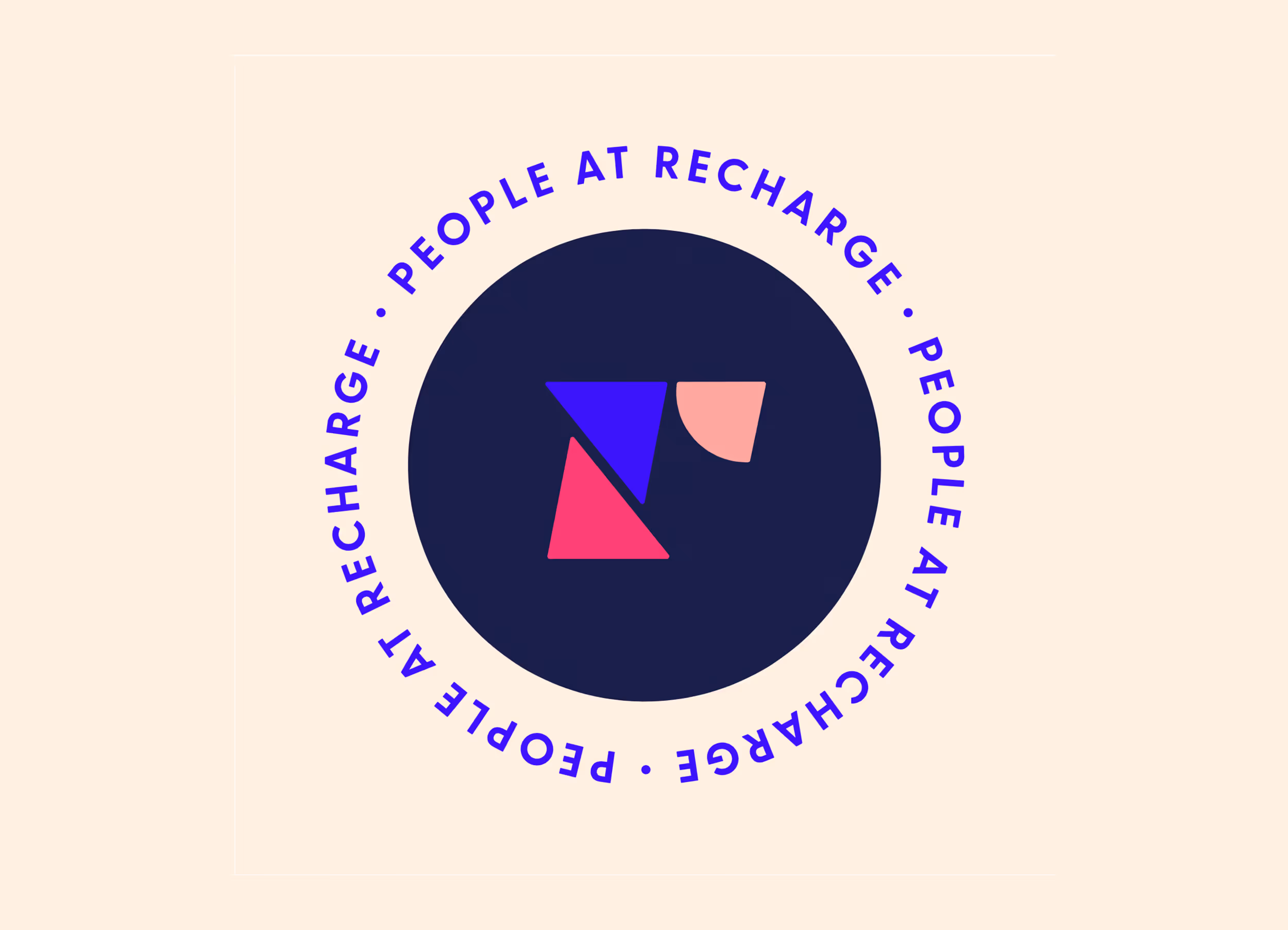
Intermingling shapes, varied textures, colors, and lines reflected the brand’s mood without being overly literal. A playful stamp injected whimsy and provided an alternate mark for People-specific materials. Guidelines defined best practices for the new brand and applications for both designers and the People team.


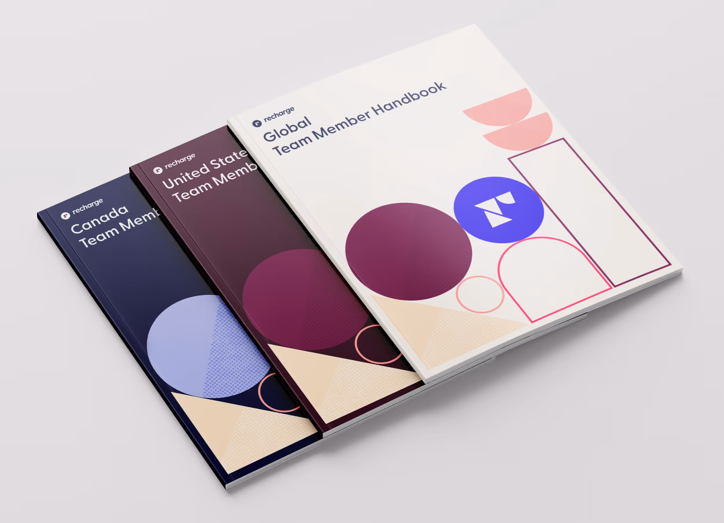

Employee handbooks incorporated brand elements for team members worldwide. A spread shows the warmth of the extended color palette.

Interviewing guide showing the People at Recharge stamp and flexible shape visual language.