The previous version of the Pearl blog suffered from poor usability. Visitors had to scroll endlessly or rely on a direct link to find specific articles, and individual post pages were dense walls of text with no easy way to share content. This made it difficult for readers to engage or amplify Pearl’s insights online.
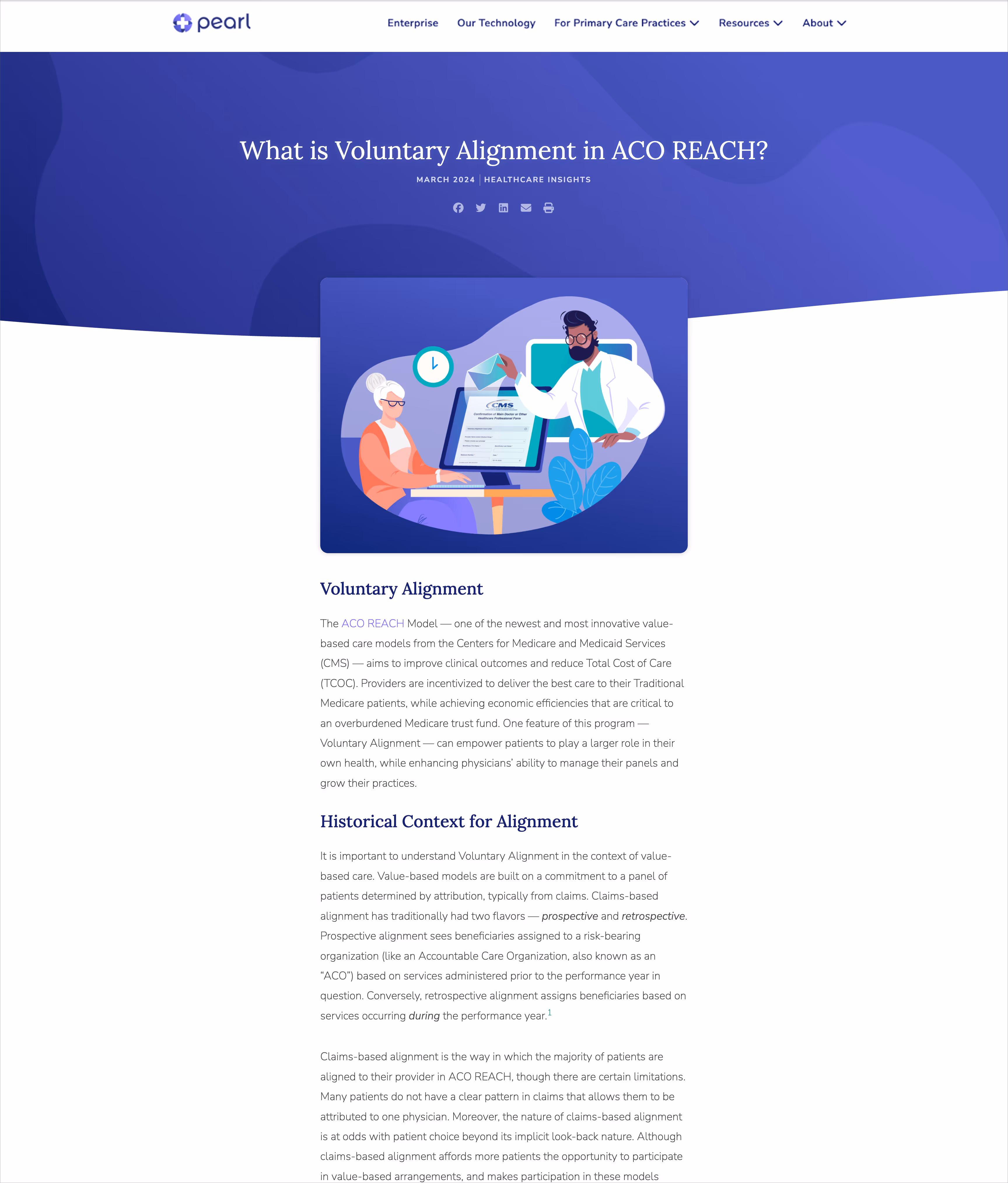
Improving the blog’s usability meant rethinking its structure with interactive elements to help readers find relevant content and clear pathways to other sections of the Pearl site. The process for header illustrations was also rethought, bringing production in-house to reduce costs (~$60K YoY) and improve brand consistency.
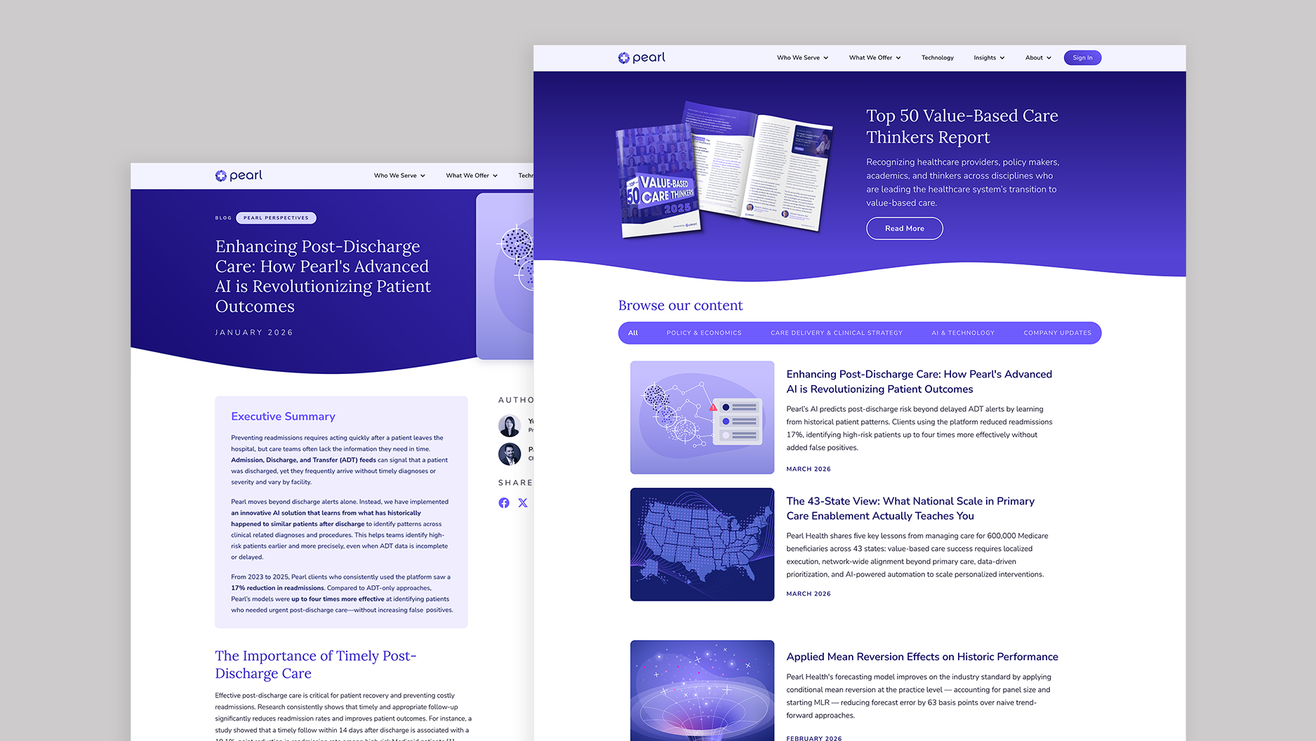
The blog homepage uses a hero to highlight top-of-mind content, while a secondary nav bar makes browsing easier. Individual posts run in a clean, single-column layout with a sticky sidebar. New header images are simpler, supporting a contemporary, engaging reading experience that highlights key insights and makes content easier to find.
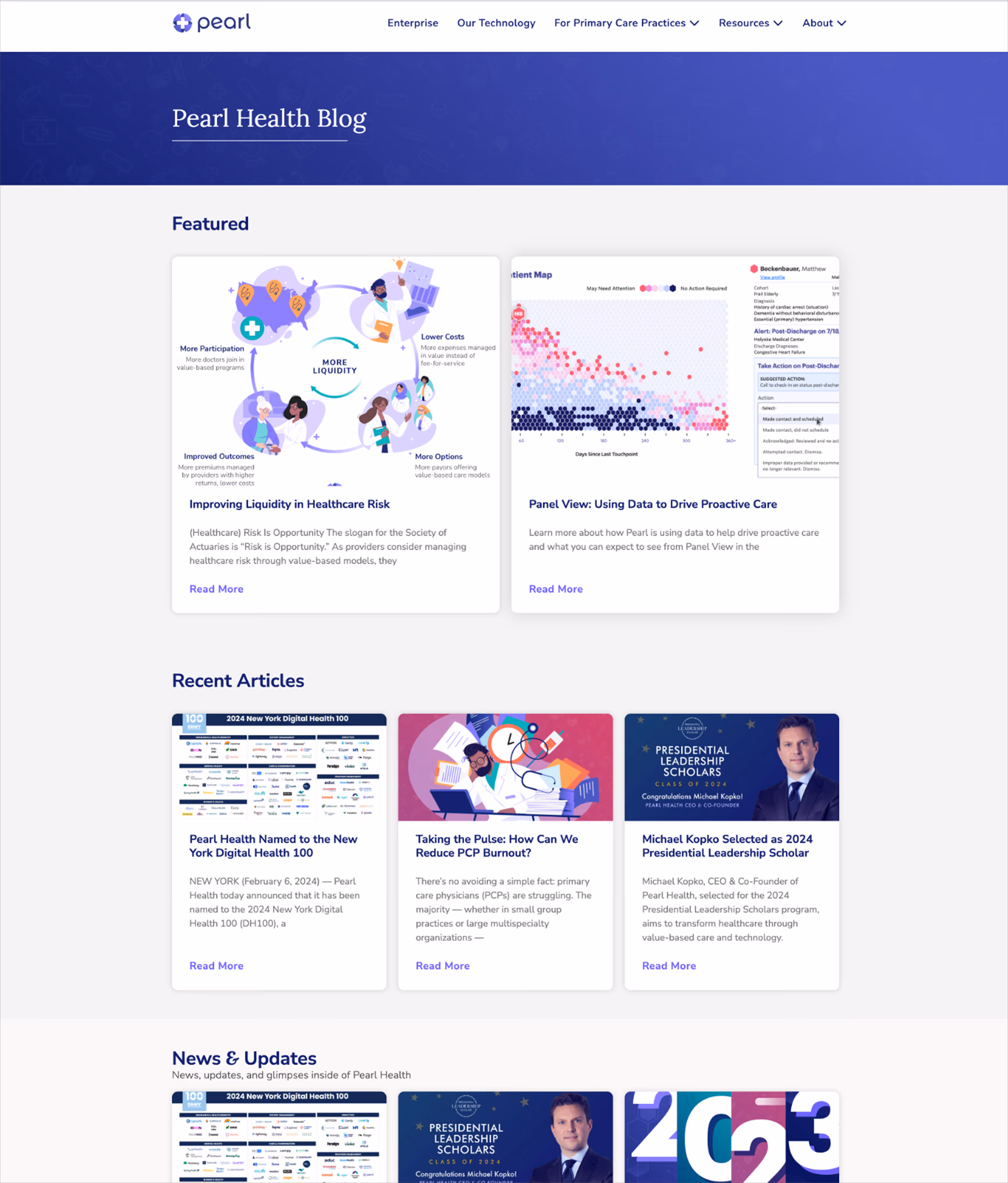
The old Pearl blog was difficult to navigate, with long, text-heavy posts that made discovering, reading, and sharing content a challenge.
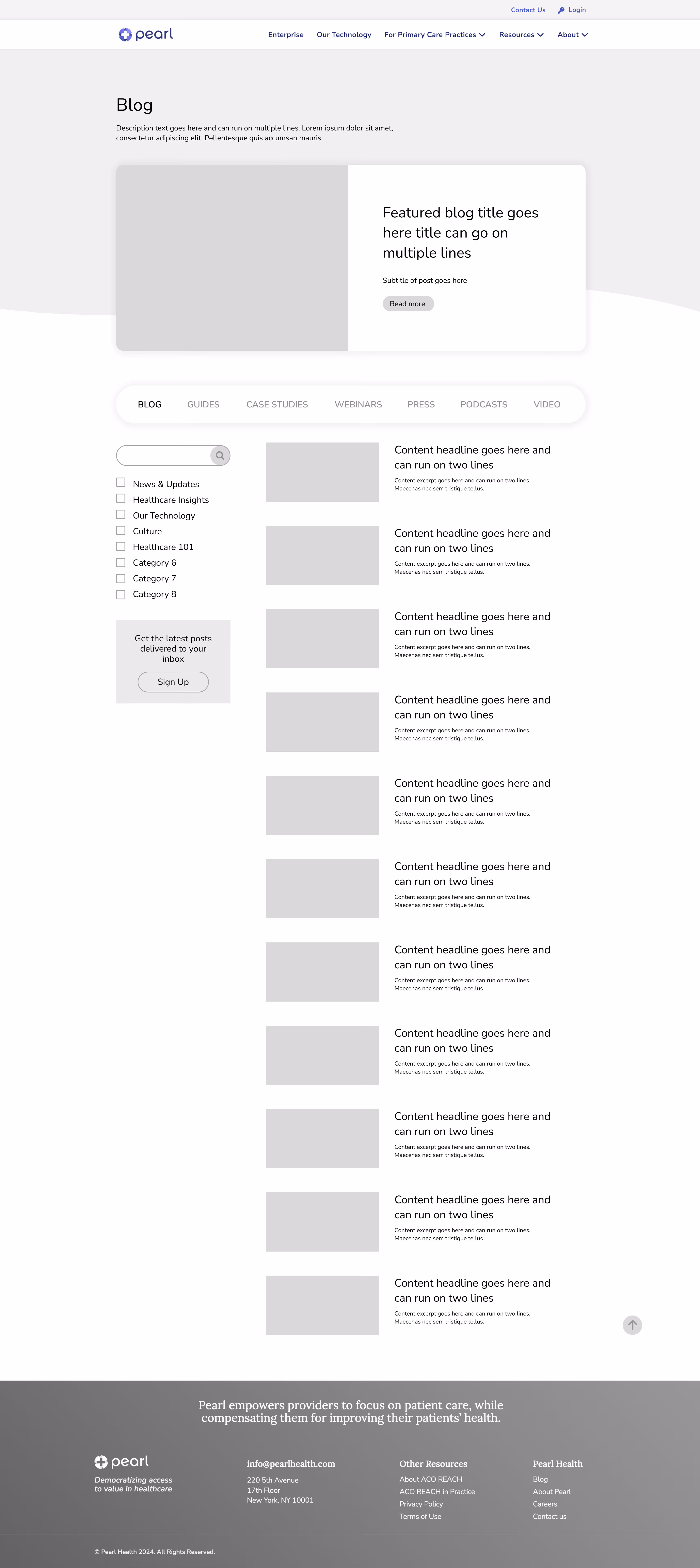
Wireframing was an essential part of the process, shaping an intuitive UX that makes it easy for readers to navigate and interact with content.
With fresh color and layout, the new pages make Pearl’s content more engaging than ever.


Old headers were produced by an external vendor with a week-long turnaround and generally needed simplification and a pared-back palette.
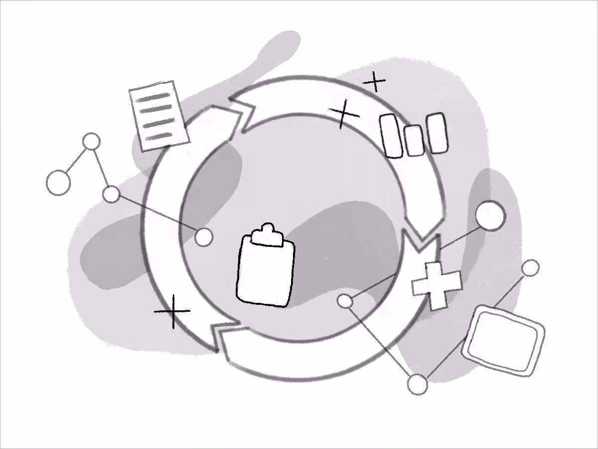
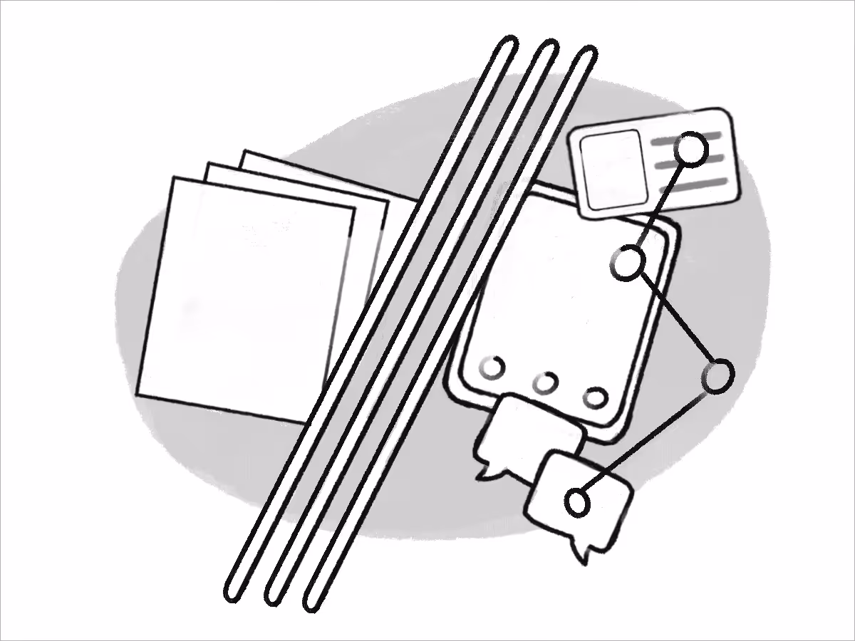
Production was brought in-house, starting with concept sketches to quickly align on direction and refine ideas before finalizing.


Final header images feature a limited color palette and reusable elements, keeping the visuals simple, sophisticated, and consistent across the blog.